How To Choose Colour
how to choose a colour scheme
Colours have the power to influence mood, ambiance and functionality of your space.
With so many colours, patterns, and shades to choose from, it’s impossible to find one that perfectly suits your home. Let's explore how to select a cohesive colour scheme, how to pair colours together harmoniously; along with practical advice on choosing colour accents to enhance your space.
__
why selecting a colour scheme is important
Colours have the power to influence mood, ambiance and functionality of any space. The right colour scheme can provide a calming effect, energise a room or even create a feeling of spaciousness. Different colours can evoke varying emotions and appeal to different personalities, so understanding the psychology of colour is key to achieving your desired outcome. The perfect colour combination can be achieved by balancing warm and cool tones, complementing colours on the colour wheel or highlighting a focal point with a contrasting accent pop of colour.
A carefully chosen colour palette is a fundamental aspect of interior design, and it can make all the difference in creating an inviting, cohesive and visually pleasing space.
__
how to choose a colour scheme
It can be overwhelming to select colours that work well together and create the desired ambiance. Choosing the perfect colour palette can set the tone for the entire space. The first step is to determine the overall mood or feeling you want to convey. Your home is an extension of your personality, each space reflecting a different facet of yourself. Consider the colours, textures and furniture in your room, and see how they make you feel. When you analyse your space, you not only consider the physical aspects of the room but also its purpose. Is your bedroom a sanctuary where you can unwind after a long day or a multi-functional space where you work from home and sleep? Do you want a calming oasis or a lively and energetic atmosphere? It is important to choose a colour scheme that reflects the desired atmosphere.
Once you have a clear idea of the mood you want to convey, start with a base colour and build from there. But don’t forget to consider the existing decor and furniture in your space. You don't want your colour scheme clashing with any elements that can't be changed easily. Also consider the amount of natural light that the space receives. Colours can appear different depending on how much light they are exposed to, so it's crucial to choose a scheme that works well with the specific lighting of the space.
Ultimately, the best colour scheme is one that makes you happy and reflects your personality.
__
the 3 colour rule in interior design
When it comes to interior design, there are certain rules that can help you create a cohesive and visually appealing space. One such rule is the '3 colour rule'. This rule involves choosing three colours that work well together and using them throughout the room in different proportions. The three colours typically include a dominant colour, a secondary colour, and an accent colour.
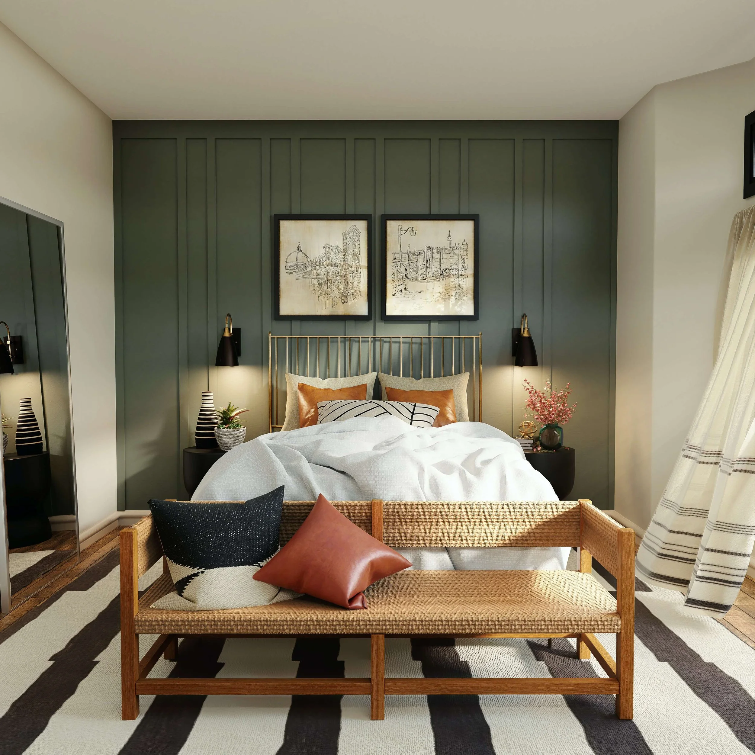
The 60-30-10 rule suggests using one colour for 60% of the space, another for 30%, and a third for 10%. The dominant colour will be the main colour used in the room, while the secondary colour will be used sparingly to add depth and interest. The accent colour can be used in small touches throughout the space, such as in decorative accessories or artwork. Use a colour wheel to help you choose complementary colours or go for a monochromatic look with varying shades of the same colour. Following this simple rule can help bring balance and harmony to your interior, making your space feel more put together and polished.
__
Select a primary colour + 2-3 accent colours
Choosing the right primary colour can make a huge impact on the overall mood of a space. If you are after a calm, soothing vibe, opt for a pale blue or soft grey. On the other hand, if you want to create a dramatic, bold statement, a rich red or deep navy could be the way to go. Remember, the colour you choose should reflect your personal style and complement the existing decor in the room. Don't be afraid to experiment with different shades until you find the perfect one that makes you feel right at home.
Choosing the right accent colours can really make or break a design. When selecting 2-3 accent colours, it is important to ensure they complement each other rather than compete for attention. You want each colour to add to the overall aesthetic instead of detracting from it. Consider the mood and tone you want to set with your design and choose colours accordingly. For example, if you want a calming and serene ambiance, pastel shades of blue and green could be a great choice. Alternatively, if you're going for a bold and energetic look, opting for bright and contrasting colours like pink and yellow could do the trick. Remember, the key is to strike a balance between colours that enhance each other without overpowering the overall design.
__
Warm Versus Cool colours
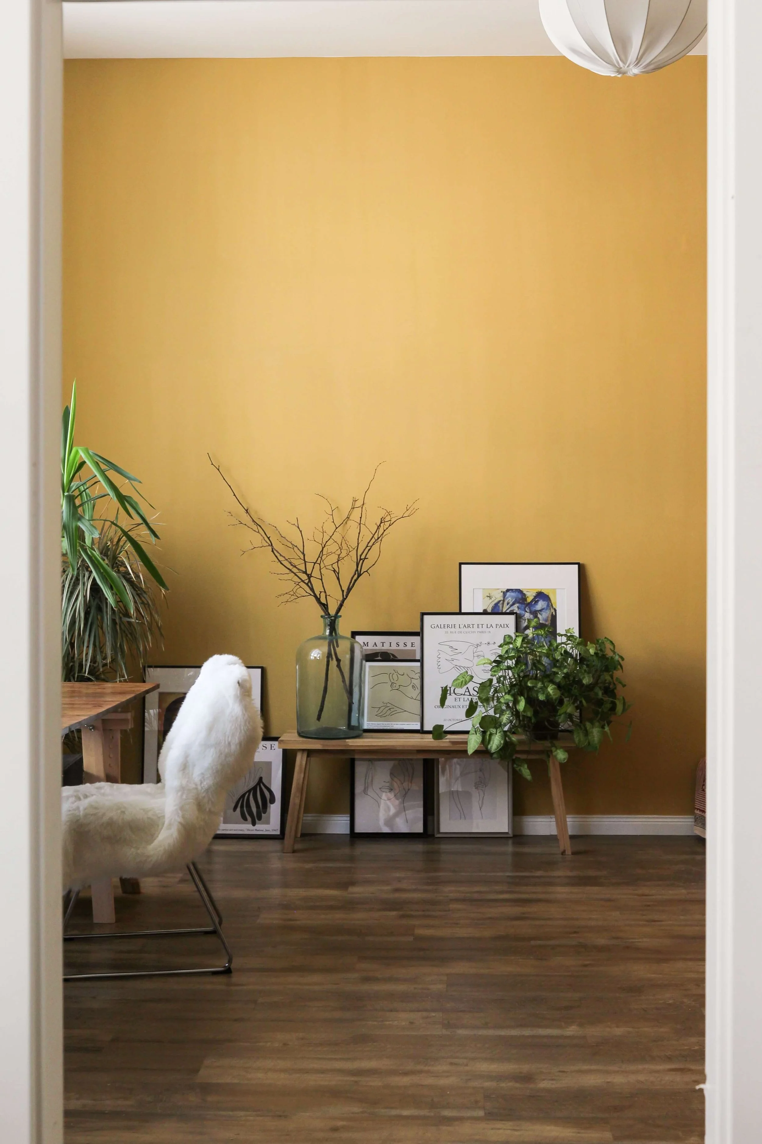
When it comes to adding colour to your space, it is important to create contrast for a visually stimulating environment. One way to achieve this is by incorporating both warm and cool shades in your decor. Warm colours such as yellow, orange, and red create a cosy and inviting atmosphere, while cool shades like blue and green give a refreshing and calming effect. Combining these two types of hues can create a dynamic and balanced look. Consider using accents like throw pillows, curtains, and rugs in complementary warm and cool colours to elevate your space.
__
How to create a cohesive colour scheme
When creating a cohesive design, the key is to start with a basic understanding of colour theory. This involves understanding the colour wheel and how to create a balanced scheme through the use of complementary, analogous or monochromatic colours. It's also important to consider the mood or atmosphere you want to create. For example, warm colours such as red and orange can create a cosy and inviting feel, while cool colours such as blue and green can create a more serene and calming environment.
Alternatively, you may want to consider an all-white palette. White interiors are timeless, serene, sophisticated, and in a way, uncomplicated. As they say, ‘simplicity is the ultimate form of sophistication’ — or explore the understated beauty of neutral interiors in your space.
Ultimately, the goal is to choose colours that work well together and reflect your personal style or brand identity. With some basic knowledge and a bit of experimentation, you can create a cohesive and visually appealing colour scheme that brings your space to life.
Helpful Colour Tools:
>> Coolers Colour Palette Generator
>> Get Colours from your photos
__
Now you know the key elements to consider when selecting a colour scheme for your space. Start by focusing on mood, harmony between colours and styles, and the balance of warm and cool tones. It is also important to remember that there are no hard rules about how many colours should be used in a single palette - it is up to you. How bold or subtle the colours are, but keep in mind the 3 colour rule: select one dominant hue, one secondary hue and an accent hue to make sure the palette looks cohesive and harmonious. Now get creative with your design – choose a winning colour scheme can help elevate your space.
__
You Might Also Be Interested In:
>> Colour Psychology
>> Coastal Colours by Design Style
>> Mood-Boosting Colours

