Styling A Shelf
“Showing off a beautifully decorated shelf really gives you an opportunity to express your personality, and style for that matter. Allow your shelf to tell a story visually (— and emotionally). A simple piece of driftwood displayed on your shelf can become a whole conversation…”
Arranging a shelf really can become a design project in itself! Today I would love to share some simple formulas that you can use to style and decorate your shelves. Here are some tips to understand the basics of how to style a shelf.
I tend to follow a process when I decorate shelving. Read on to discover my six-step approach to arranging and styling a shelf.
// Step 1
ASSESS THE SPACE
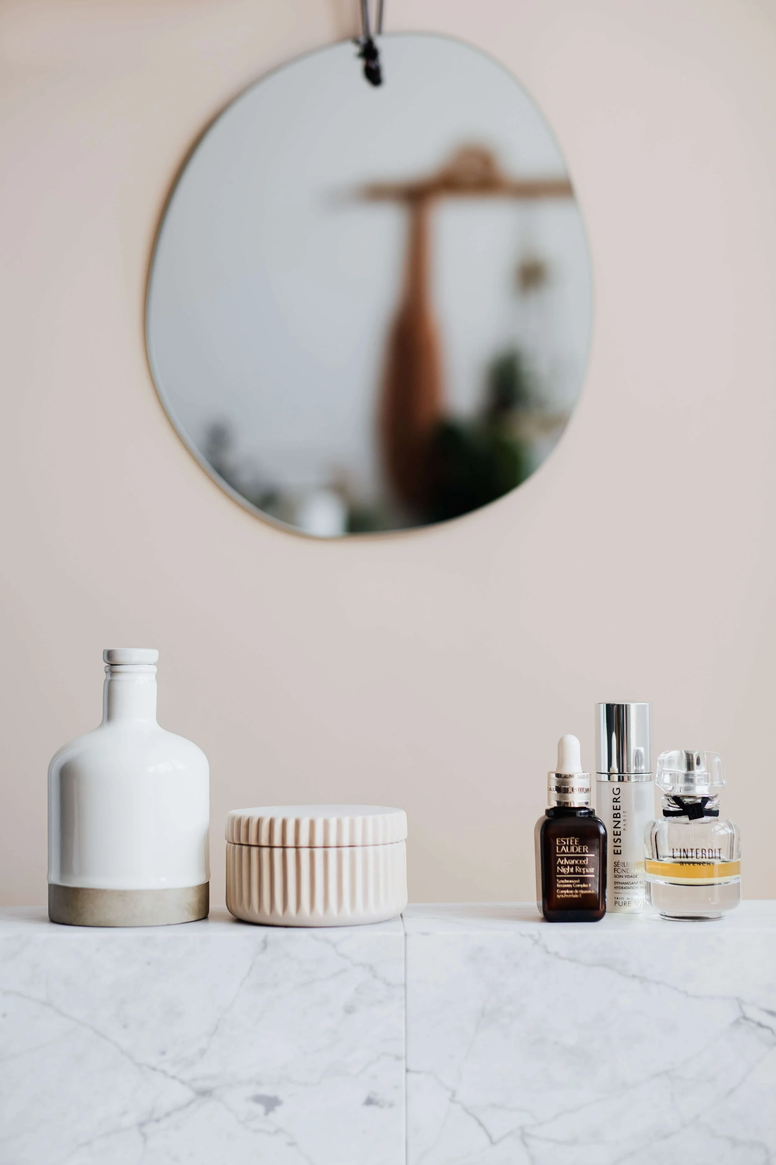
Consider the height, the depth and the number of shelves. Like with anything related to interior design, it is important to have a clear and consistent vision when styling shelves - this applies to the items placed on the shelf as well as the shelf decor in relation to the overall space. Give your shelf décor some breathing space using neutral accessories — this ensures that your shelves don’t look too overbearing or mismatched. Often, very simple items will result in something incredibly stylish with a very effortless feel. Personally, I love styling entirely on the neutral palette for a look that feels sophisticated and simply timeless. Earthy tones, whites and natural materials are my staple ingredients.
// Step 2
GATHER THE ITEMS YOU’D LIKE TO DISPLAY
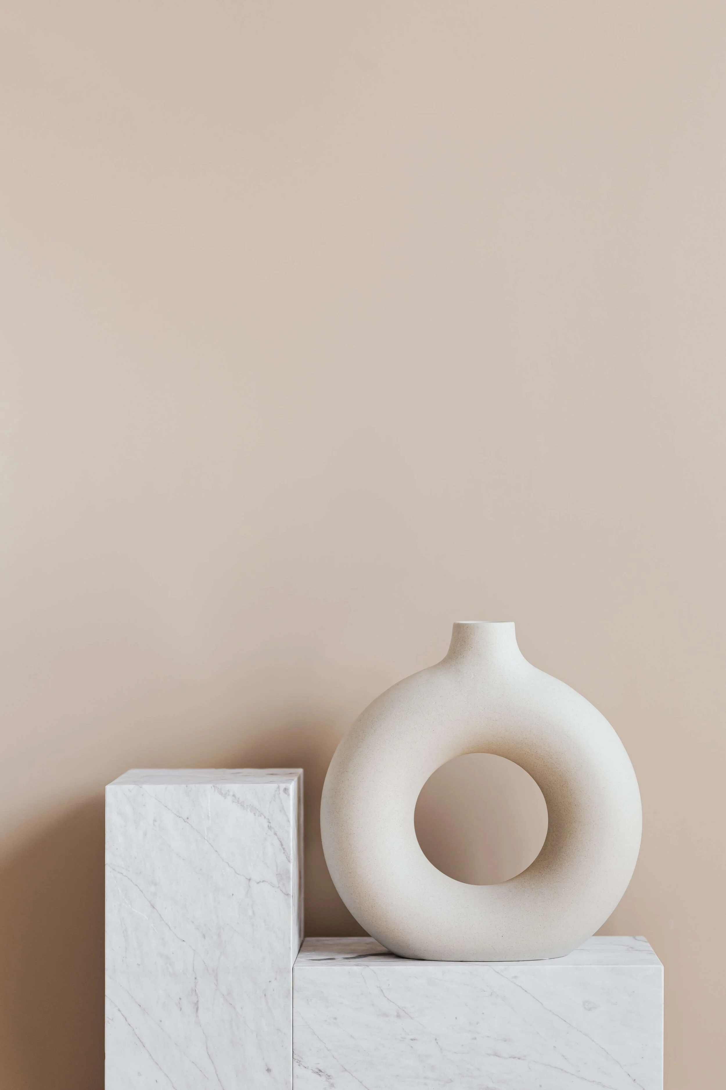
Gather all your ‘supplies’ for the shelf, these could include ornamental items, collections, plants, picture frames, baskets, bowls and any other knick-knacks you which to display. I love vases and ceramics of all sizes, shapes and textures (you will often find me buying accessories in threes - it is just one of those habits — often a group of ornamental items can create more impact than a single item). I also adore coral sculptures to create a coastal feel. I use coffee table books to display these as ‘art pieces’. Books can be artfully tilted and stacked horizontally and vertically. You could even create a colour story by coordinating your book spines to create pops of colour, create a colour blocking effect, or match new and old books for a little visual contrast.
Ensure you collect a good variety in terms of size, shapes, heights - and don’t forget about different textures. Add a little personality, something unique, something quirky, something ‘you’. Curated collections can give a stylishly sophisticated feel to your space.
“Sprinkle a few smaller items in the spaces that need filling in a bit. Combining larger and smaller pieces creates a balanced look. However, resist the temptation to clutter the shelf, this might have an adverse effect on the overall appearance of your display (unless you’re looking for the ‘maximalist’ way of decorating your space, of course!).”
// Step 3
BALANCE AND VISUAL WEIGHT
No matter whether you are styling a bookshelf, coffee table, your kitchen shelving or a mantle, it is important to find balance. Making your various items work together is about thinking of them as a single ‘unit’, it really is all about composition.
I typically find it easier to start with placing the larger items first. Larger items demand a little more attention and create the primary focal point on your shelf. Oh yes, some pieces are even large and dramatic enough to stand alone. So let your most striking accessory take centre stage; and accessorise with more intricate items. Encourage your eyes to be drawn upward. Another little trick is playing with light. I love reflective materials such as glass or polished metals. This can add a very vibrant layer to your designs.
Open and floating shelves, or iron hardware give a space a contemporary flair.
// Step 4
VARIETY, CONTRAST AND COLOUR
Interesting shelves are packed with different objects (in different sizes); varying colours, shapes, textures and patterns. Play with the composition of the shapes and heights of your items, but try to keep them in relation to each other.
I often try to add a little contrast, be it through materials or shapes. The coastal style is a down-to-earth, tactile look. Natural materials are key. In my coastal way, I often combine soft materials with hard, i.e. rattan baskets with hand-blown glass that looks like sea glass, natural agate pieces, nautical rope, a jar of shells, a beautiful coral ornament, a sea fan, hurricane candle holders or a simple concrete candle next to a piece of rustic driftwood. Buoyant glass balls look stunning as a rustic coastal shelf display too. It is the variety and contrast in different decorative items that makes a space most interesting, a little contrast goes a long way. Talking about contrast, consider colour as an element when you decorate your shelf. I love the soft hues of the sea. I then repeat similar tones of blue and green combined with neutral and earthy colours throughout my home.
And why not consider painting the inside of your bookcase a shade deeper than your wall colour for extra depth. Alternatively, opt fot a whitewash look for that airy coastal feel.
// Step 5
GREENERY
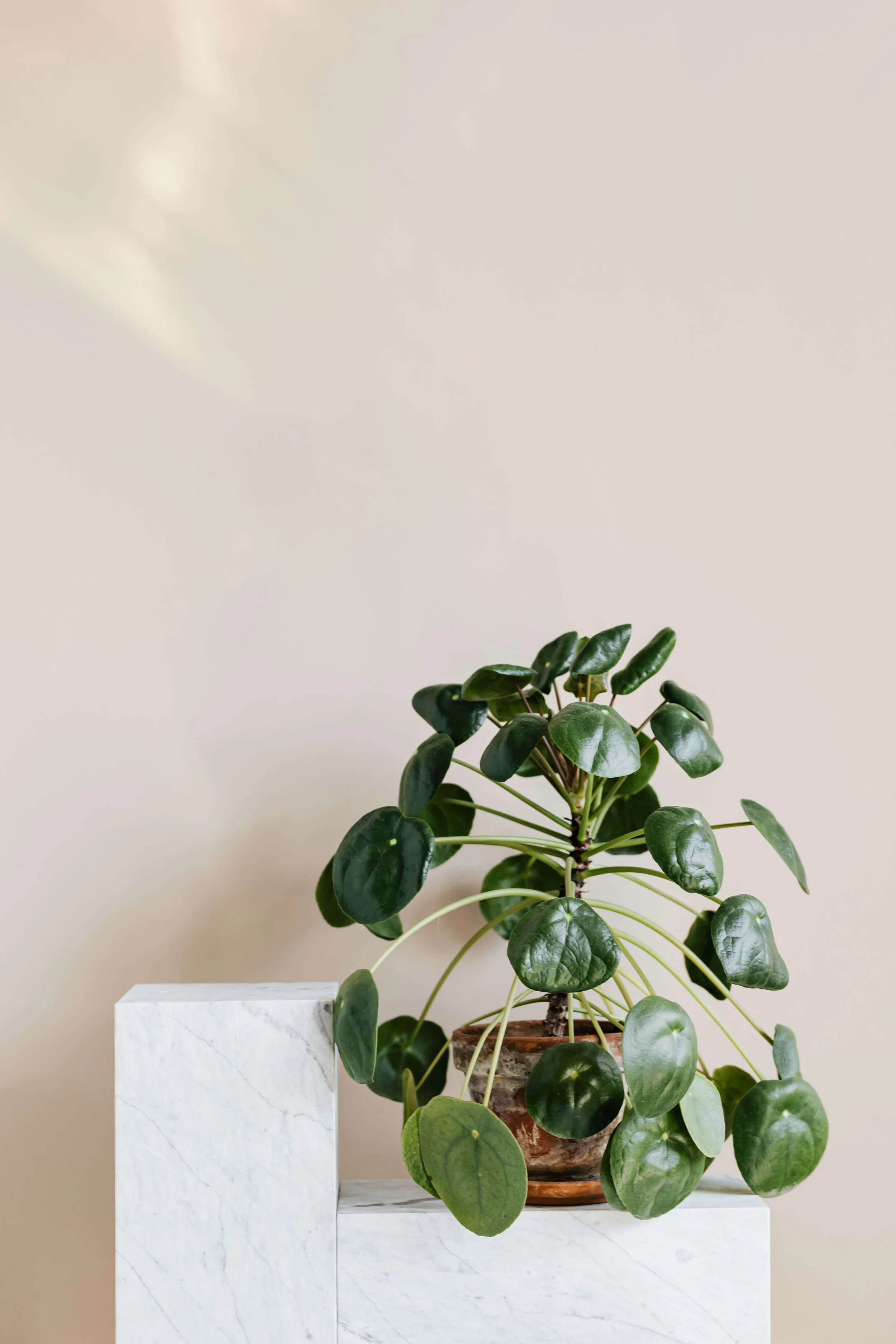
Place some plants on your shelf, this adds life and texture. Draping plants on the edge of a shelf cascading to the shelves beneath it create further interest and ties the look together beautifully. Read more about biophilic design.
// Step 6
LAYERING
Remember, your shelf is a three-dimensional object. Another way to add a little interest is by creating a layered or overlapping effect. Don't be afraid to partially hide some items. Place bigger items towards the back then layer forward with smaller accents at the front; or stagger a set of items in a balanced way. Leaning artwork can be incredibly stylish. Mess with the clean lines…
Move things around to see how they look in different places, stand back a bit and assess if things are working. Give yourself a little time to tweak throughout the process, over time and with the seasons. But ..... beware of over-styling. Having said all that, yes - keep in mind some basic styling principles, but do not forget that a shelf really is at its best when it looks less thought out. Give the eye some obvious focal points but also some space to rest. ‘Resting space’ does not have to be empty space as such, it can simply entail some low visual movement using more neutral items to create just that little breathing space.
__
You Might Also Be Interested In:
>> How To Hang Wall Art
>> How To Mix Metal Finishes
>> The Elegance of Linen Cover Books


